Monday, 21 November 2016

Sunday, 20 November 2016
Storyboard (Rugile Oraite)
To be fair, this is a very rough storyboard. This is because this is the most basic explanation of our shots. A lot of the "in-between" shots will most likely be decided in the moment once we can visually see what appears good on the camera and with the lighting set up. However, I will keep updating the story board if and when we make changes and additions.
Genre of our Film (Rugile Oraite)
Genre/Sub-genre of Film
KEN PARK
Ken park is a youth drama film that we have been majorly inspired by. This whole film is sectioned off and about the lives of main 3/4 characters who somehow are also involved with each other. The thing that we really like about this opening sequence is that at the very end, something critically important happens that gives the rest of the film a motivation. That is exactly what we want our opening credits to do, except ours might be a bit more subtle.
SUBMARINE
Submarine is another youth drama film that we have taken inspiration from. What really stood out for us in this opening sequence is how shots of surrounding areas are used to create a specific atmosphere and mood for this film. This is what we want to do.
Thursday, 17 November 2016


Wednesday, 16 November 2016


Tuesday, 15 November 2016
Genre Conventions within Youth Drama
Genre conventions
 Font
Font
 I have noticed even though the character age of the main characters are generally around a late teen to early adult the fonts somewhat contradict that, as they are seen here as crudely written childish handwriting. This emphasises the still childlike characters, despite the themes of the film.
 In some genres like horror and thriller the opening sequences focus on the main characters obsession/addiction. Through the research I have conducted into youth drama I have found usually the main character is at the centre of the sequence although we are simply following him/her through there daily activities. Or also the length of the title sequence is used as a large metaphor about one of the main characters.
FontI have noticed even though the character age of the main characters are generally around a late teen to early adult the fonts somewhat contradict that, as they are seen here as crudely written childish handwriting. This emphasises the still childlike characters, despite the themes of the film.
Character focus
 In some genres like horror and thriller the opening sequences focus on the main characters obsession/addiction. Through the research I have conducted into youth drama I have found usually the main character is at the centre of the sequence although we are simply following him/her through there daily activities. Or also the length of the title sequence is used as a large metaphor about one of the main characters.
Thursday, 10 November 2016
Production schedule(so far)


This is our production schedule. Its not 100%. Things may change due to a possibility of rain so if necessary we may change the schedule to suit us.


Monday, 7 November 2016

Institutional Details of example films
WE NEED TO TALK ABOUT KEVIN
Who Distributed it?
Oscilloscope is an independent film company founded by Adam Yauch.
The Marketing tools Used
This film is has reviews on a very powerful poster. This poster was used as the main ad everywhere, for example billboards.

The Role of Social Media
We Need To Talk About Kevin did not have its own social media pages, none that I am aware of anyway. The only ones i could find were the Wikipedia page, IMBd and Rotten Tomatoes.
Type of Release
This film was release internationally
thirteen
Thirteen
DISTROBUTIONS ARE FOX SEARCHLIGHT PICTURES
THE MARKETING TOOLS USED IS SOCIAL MEDIA , TV CHANNELS , POSTERS AMD IN SOME INTERVIEWS.
 THE ROLE OF SOCIAL MEDIA
THEY DID NOT HAVE THEIR OWN WEBSITE BUT THEY WORE ADVERTISED ON DIFFERENT WEBSITES AS IT RELEASED.
DIFFERENT FORMATS THE FILM IS AVAILABLE IN
DVD
BLU-RAY
PRINT
 IT HAD WIDE RANGE OF RELEASES IN DIFFERENT CINEMAS AROUND THE WORLD , BOTH NATIONALLY AND LOCALLY.
MUSIC WAS BY Mark Allen Mothersbaugh.
DISTROBUTIONS ARE FOX SEARCHLIGHT PICTURES
THE MARKETING TOOLS USED IS SOCIAL MEDIA , TV CHANNELS , POSTERS AMD IN SOME INTERVIEWS.
 THE ROLE OF SOCIAL MEDIA
THEY DID NOT HAVE THEIR OWN WEBSITE BUT THEY WORE ADVERTISED ON DIFFERENT WEBSITES AS IT RELEASED.
DIFFERENT FORMATS THE FILM IS AVAILABLE IN
DVD
BLU-RAY

| Box office | $10.1 million
|
|---|
MUSIC WAS BY Mark Allen Mothersbaugh.
Thursday, 3 November 2016
Wednesday, 2 November 2016

Influential ideas
INFLUENCES
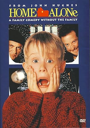
I really liked the use of sound in this film. It was very effective as they used very jazzy like music to represent an innocent boy's life alone in new york city. Although it doesn't go as planned and the movie slowly changes its mood from happy to mysterious. The sound they started using became more fast and and a little bit spooky once we are introduced to the robbers.This made the film seem interesting throughout.

The storytelling was really enjoyable and very effective. We get introduced to the family by seeing them on the screen physically instead of reading their names on the title sequences. I think this is creative and different therefore makes it stand out.
The colour in the film AVATAR wore used really brightly. The film expresses many different colours/neon lights which makes the viewer more amazed and eye forced into the film. I really like how the designer made the light blue skin colour on the characters making them stand out , as well as using unrealistic characters but making them look real in the movie makes it so much more interesting and enjoyable to watch.
Subscribe to:
Posts (Atom)